The Objective
Radiation therapy is an intense experience for patients.
Lying flat for treatment, with no eye contact with the care team, adds to the sense of discomfort, claustrophobia, and fear.
Leo Cancer Care set out to change that. With an upright radiotherapy solution, they are transforming the patient experience as well as the effectiveness and economics of radiotherapy.
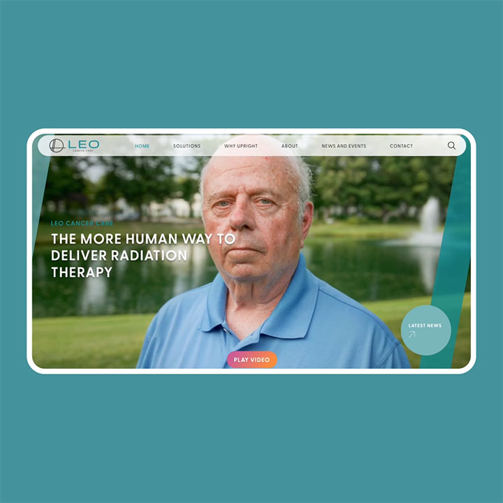
Leo Cancer Care’s previous website and brand didn’t reflect the warmth, innovation, or optimism of their work. Our task was to elevate their brand and digital presence by creating an identity that captures who they are, what they stand for, and why they matter.
Strategy and Process
We began with an in-person workshop to immerse ourselves in Leo Cancer Care’s world, understanding their people, products, and most importantly, their purpose.
This session helped uncover the core of their brand personality, shaped by three key values:
- Human: Putting people and patients first in everything they do
- Accessible: Making complex technology approachable and inclusive
- Transformational: Challenging conventions to create meaningful change
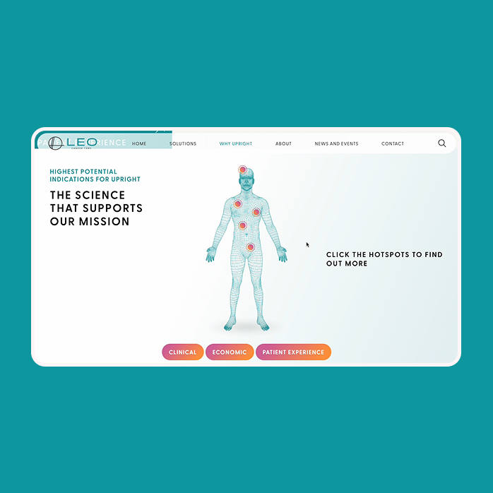
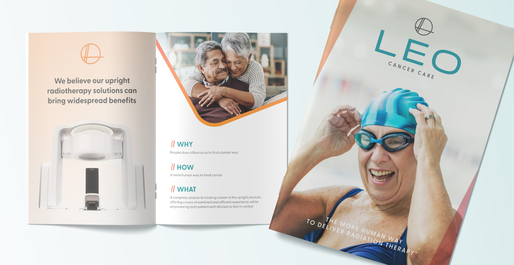
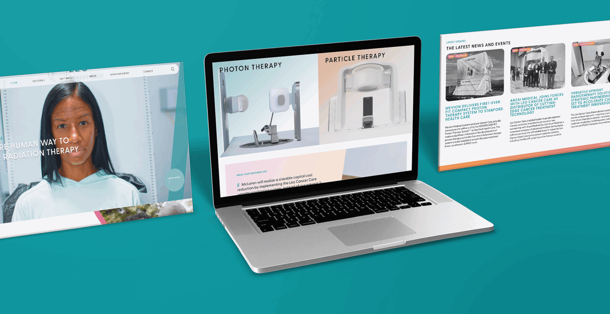
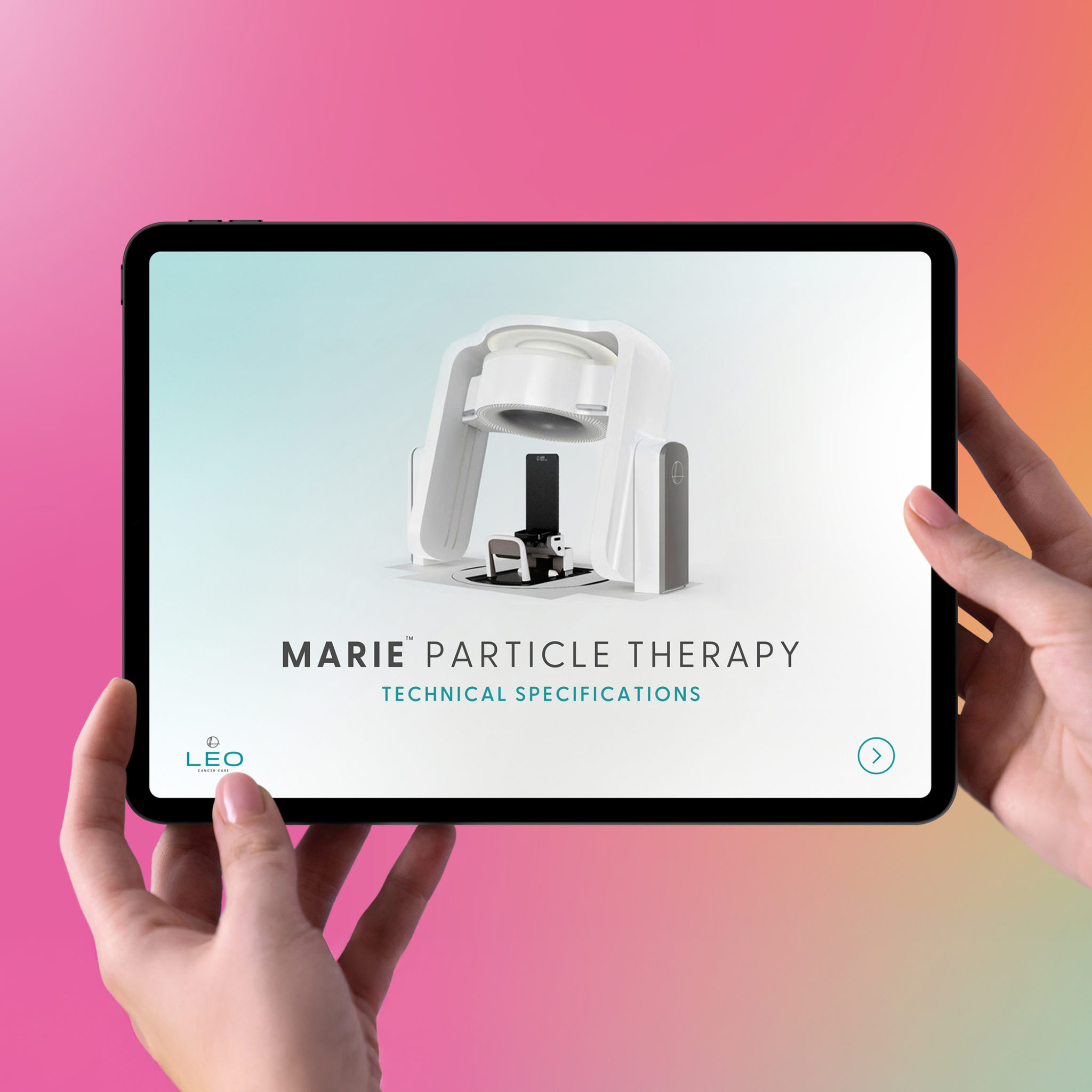
These values informed every creative decision. We developed a refreshed visual identity, brand tone of voice, and website architecture that set Leo Cancer Care apart in a traditionally clinical, blue-dominated sector.
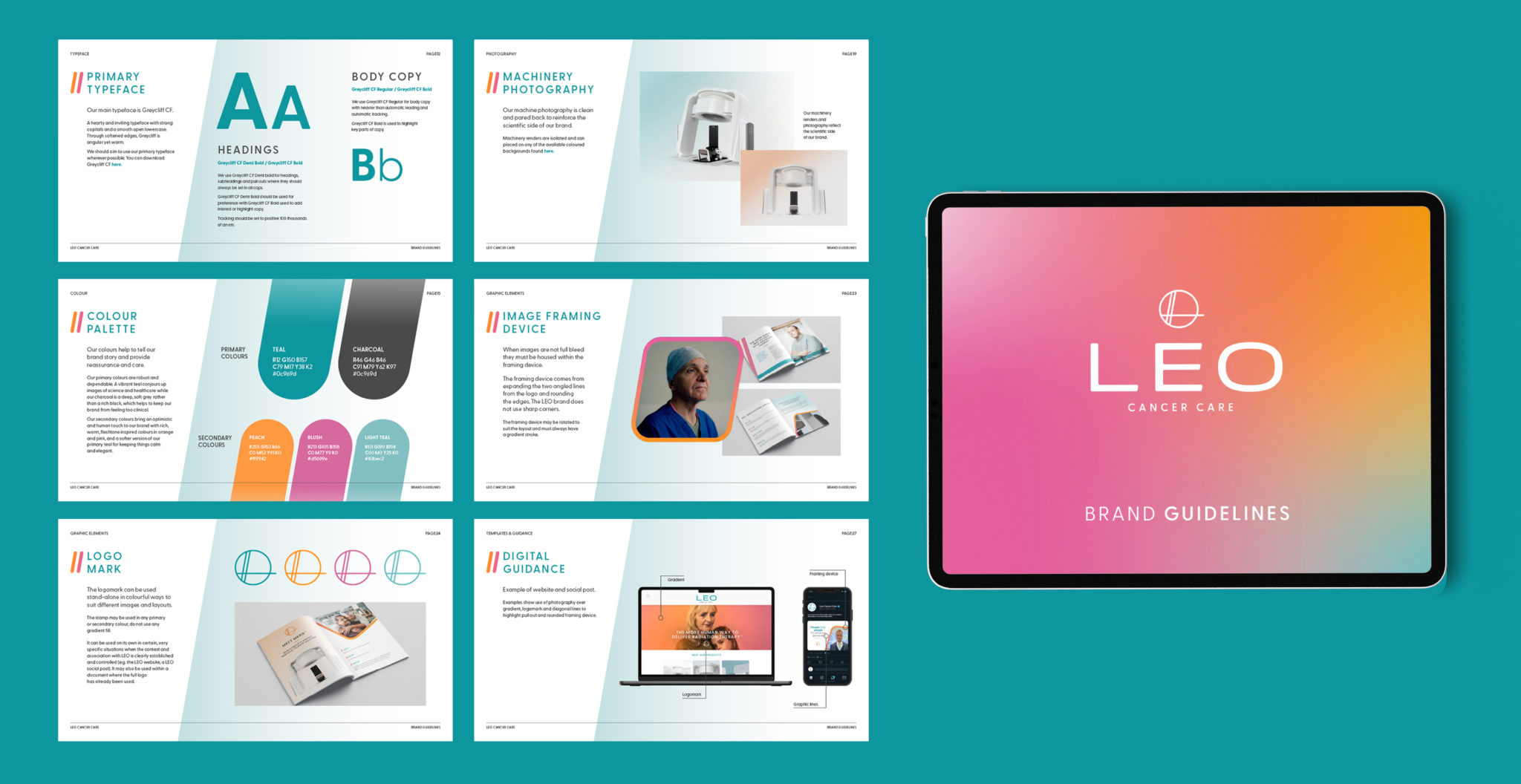
The visual identity focused on:
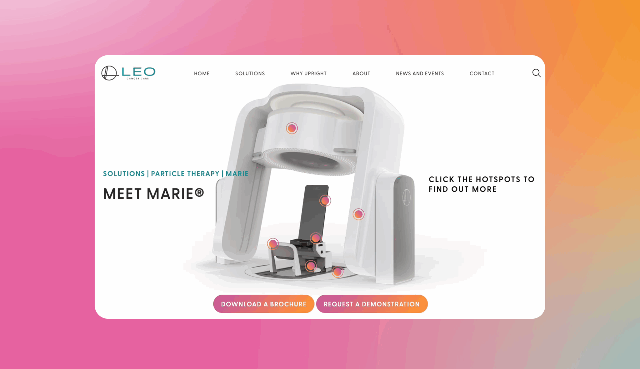
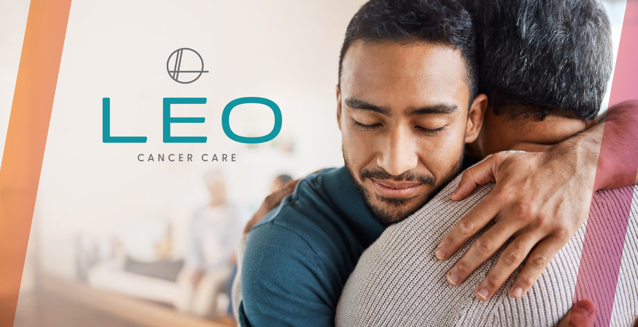
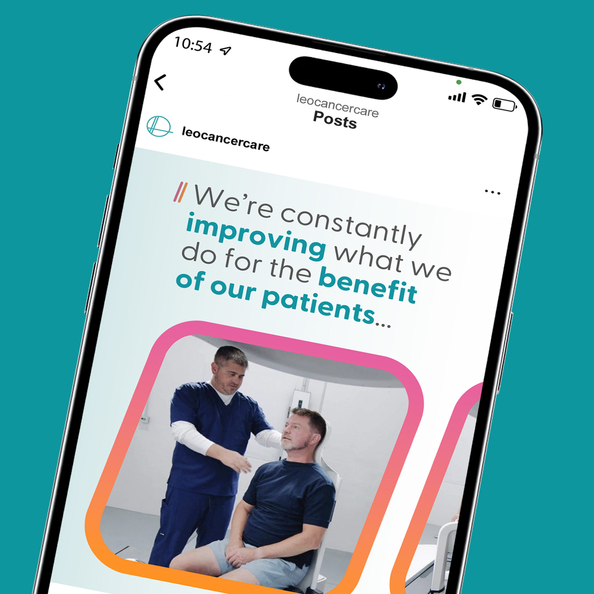
- Colour and Gradient: Introducing warmth and vibrancy while retaining the familiar teal for continuity
- Typography: Softer, rounded letterforms to reflect the brand’s approachable nature
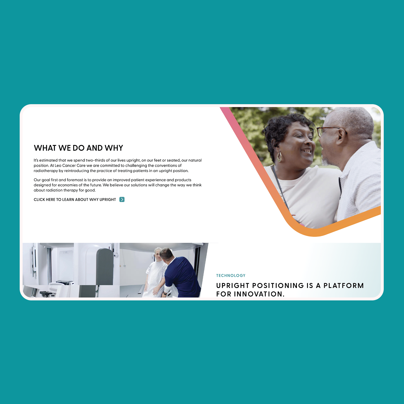
- Human Imagery: Showcasing authentic, real moments that highlight the emotional connection between patients and care teams
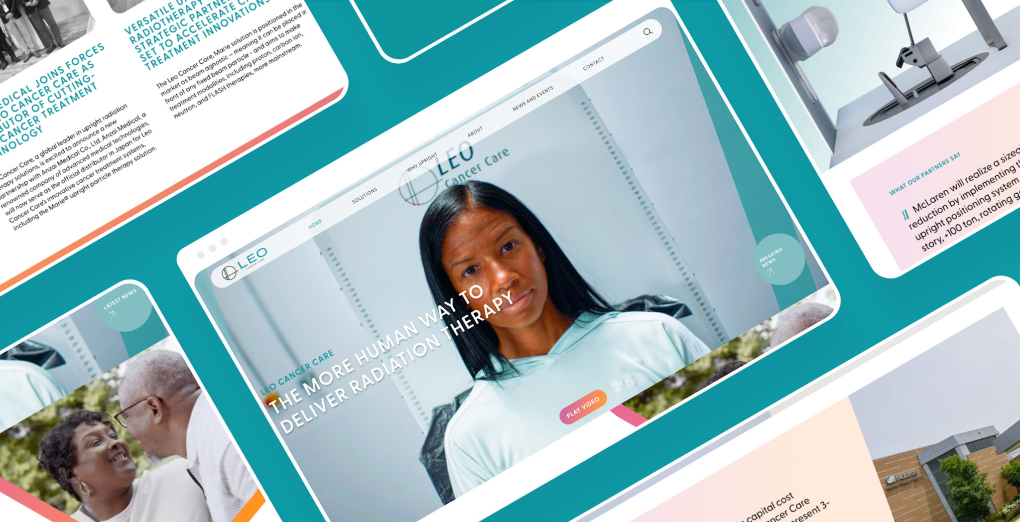
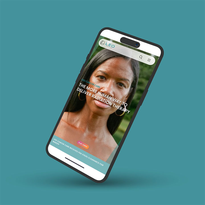
At the same time, we restructured the website to meet the needs of multiple audience types, from healthcare professionals to patients to prospective employees, while ensuring the site could be easily managed and evolve as the business grows.
We anchored the refreshed brand in Leo Cancer Care’s core belief: being More Human, By Design.
The Outcome
The result is a brighter, more human brand and redeveloped website, reinforced through clear, practical brand guidelines, design templates.
The new identity is:
- Distinct: A bold, ownable look and feel that stands apart from competitors
- Approachable: Human-first design choices that reflect care, dignity, and optimism
- Flexible: A modular website that allows Leo Cancer Care to grow without constraint
The site communicates Leo Cancer Care’s mission and values impactfully, while being easy for the team to manage and scale, thanks to an agile development mindset.
Every touchpoint, from the typography to the photography to the website UX, was designed to reflect their purpose: to make radiotherapy less daunting, more comfortable, and more human for patients around the world.
